Skip to content

GIS and spatial analysis

GIS Analysis Services

Spatial analysis and geographic data processing, delivered as reproducible workflows rather than one-off outputs.

Suitability surface produced from weighted criteria layersSparseDense

Overview

Spatial analysis that someone else can reproduce

A GIS result that exists only as an exported image is a dead end. Six months later nobody can say which version of the boundary file was used, whether the buffer was 500 metres or 500 feet, or why two runs disagree.

We deliver analysis as code: a documented, parameterised workflow built on PostGIS, GDAL, GeoPandas and QGIS, with inputs pinned and outputs regenerable. Change one parameter, re-run, and get a new answer you can trace.

That approach costs slightly more on the first project and considerably less on every one after it, because the second question is usually a variation on the first.

Real output

From operational GIS outputs to advanced spatial models

The first examples use one open dataset of 8,628 Manhattan businesses. The research figures that follow show the analytical range beyond point mapping: network accessibility, geostatistical interpolation, space syntax, significant clusters and trajectory mining.

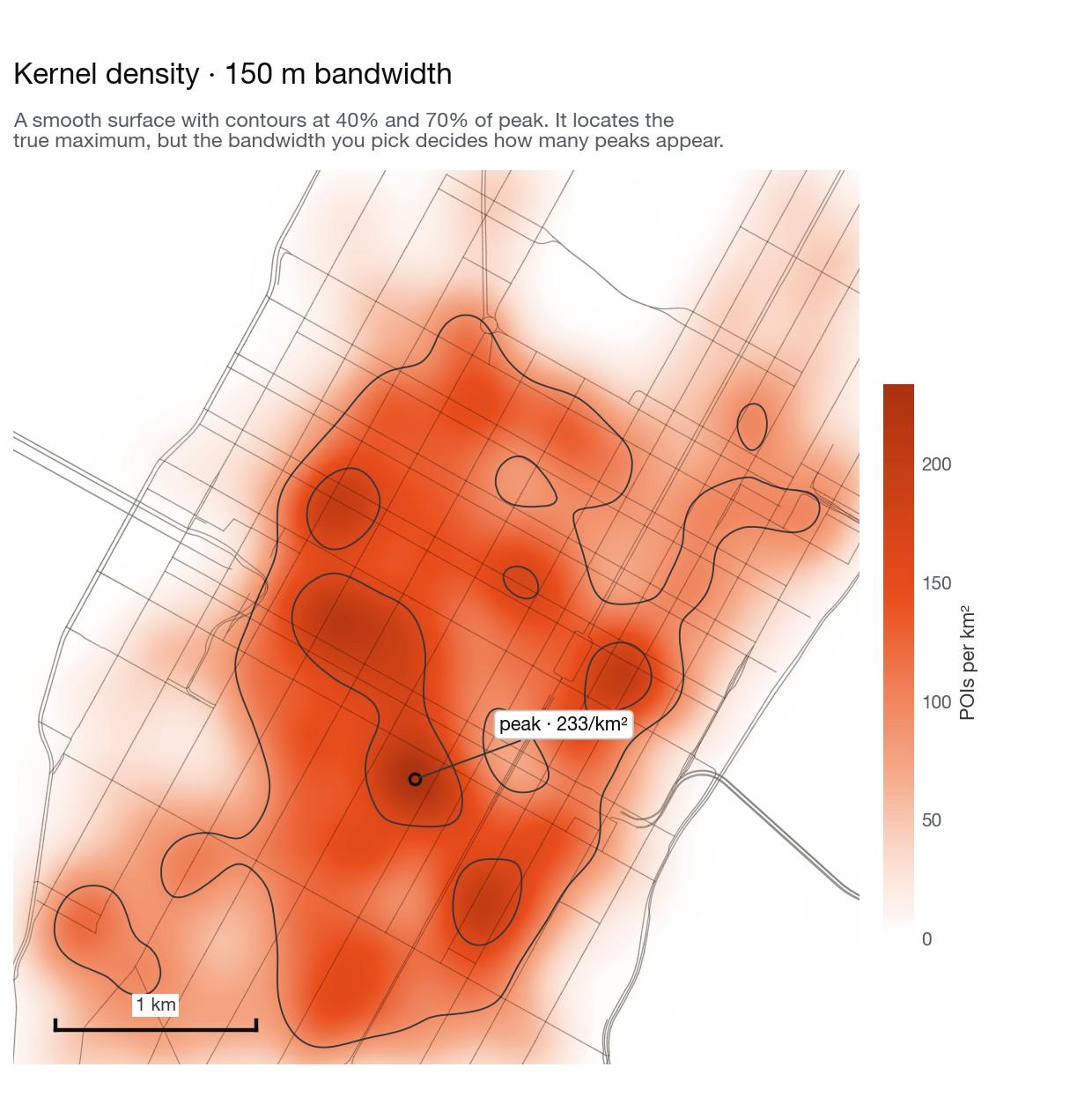
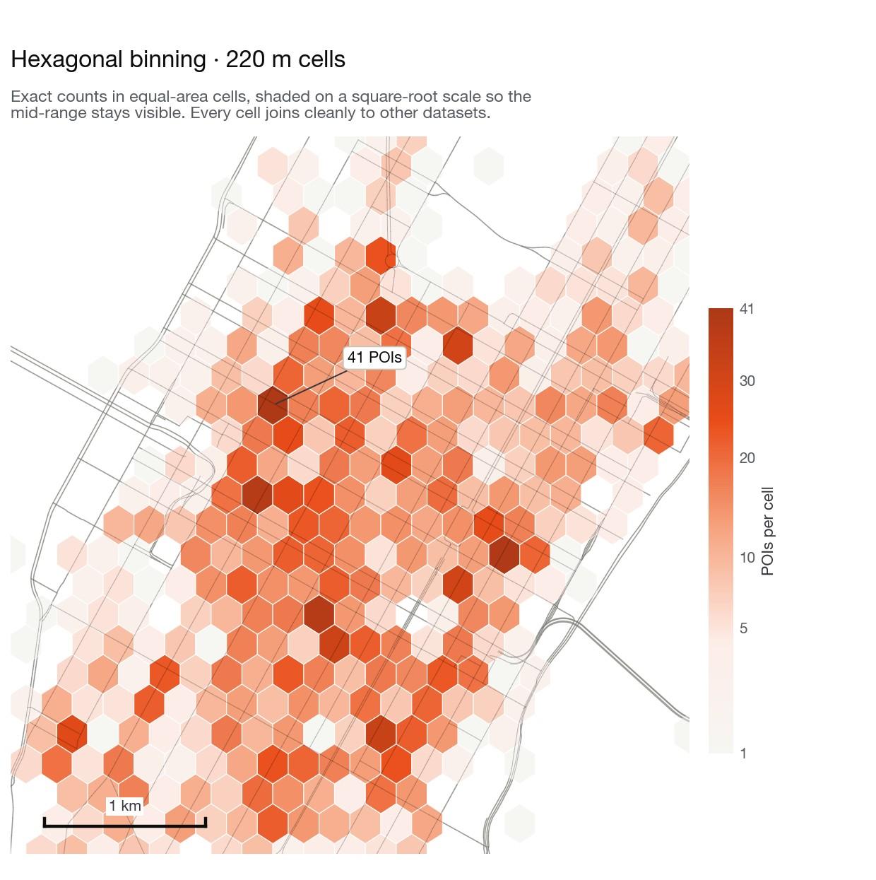
Continuous density against aggregated density

Kernel density gives a smooth surface and finds the true peaks, but the bandwidth you pick decides how many peaks there are — so we state it. Hexagonal binning gives exact counts per equal-area cell, which is what you want when districts must be compared or joined to other data. Neither is more correct; they answer different questions.

Kernel density surface over Midtown Manhattan at 150 metre bandwidth, with contours at 40 and 70 percent of peak and the maximum labelled at 233 POIs per square kilometre
Kernel density · 150 m
Hexagonal binning map of Midtown Manhattan in 220 metre cells, showing exact POI counts per equal-area cell with the busiest cell labelled at 41
Hex bins · 220 m

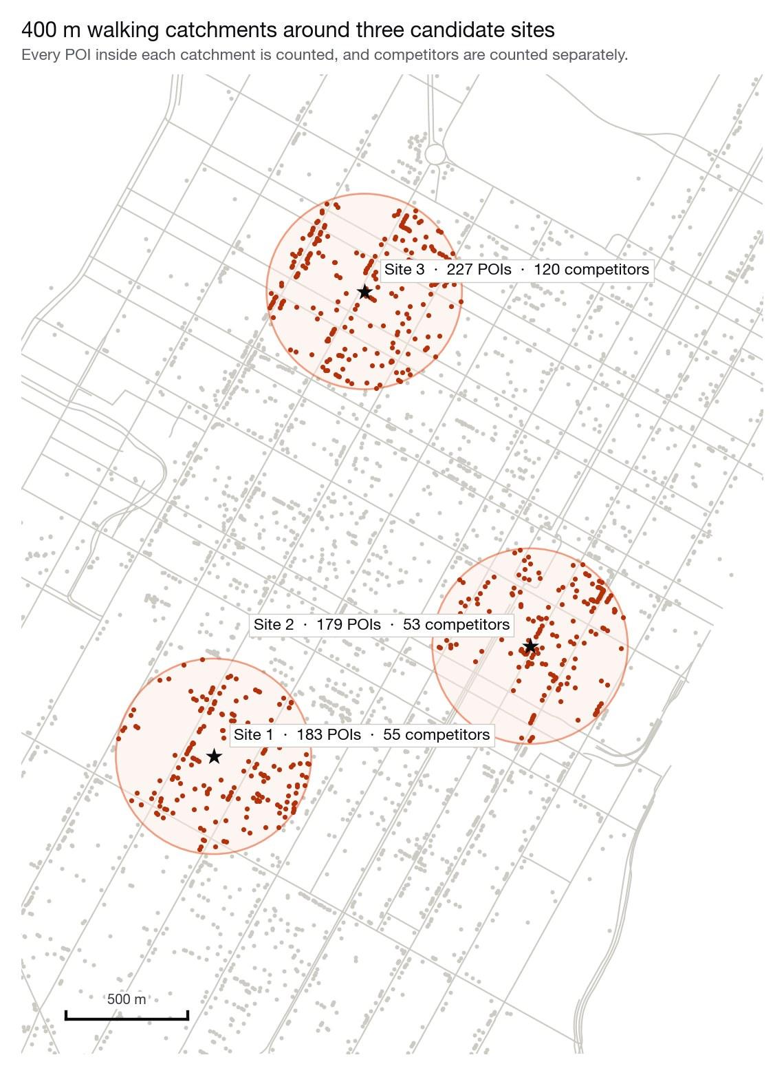
Catchment analysis around candidate sites

A 400 m walking catchment around three candidate locations, with every POI inside each one counted and direct competitors counted separately. The three sites look similar on a map and are not: one carries more than twice the competition of another within the same radius.

Map of Midtown Manhattan with 400 metre catchment circles around three candidate sites, POIs inside each circle highlighted

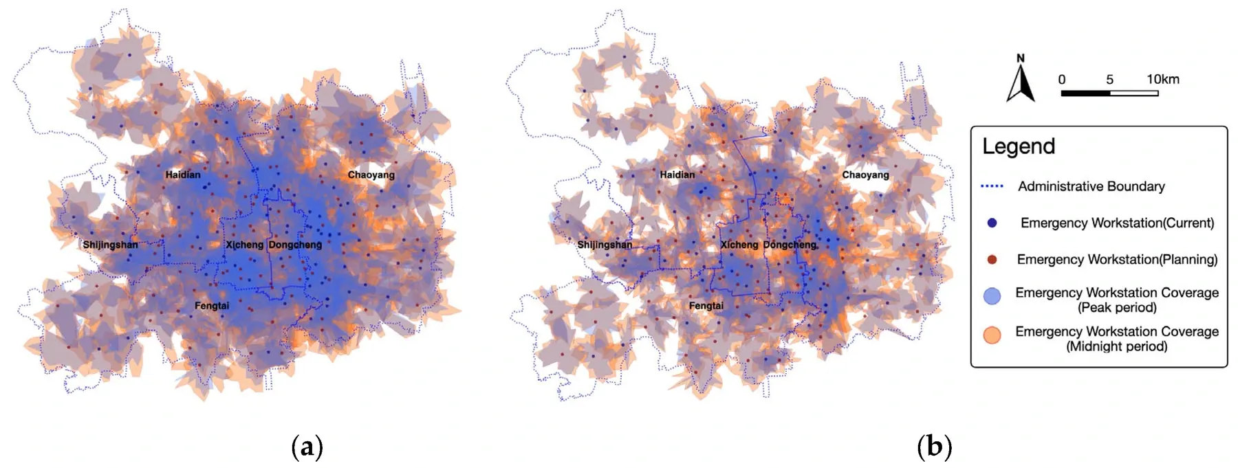
Network accessibility changes with time and congestion

Isochrones model where a facility can actually be reached within a time threshold along a network. This published emergency-service study compares 10- and 8-minute coverage and separates peak from midnight conditions, revealing overlaps and service gaps that a circular buffer cannot represent.

Interpolation surfaces and space-syntax networks

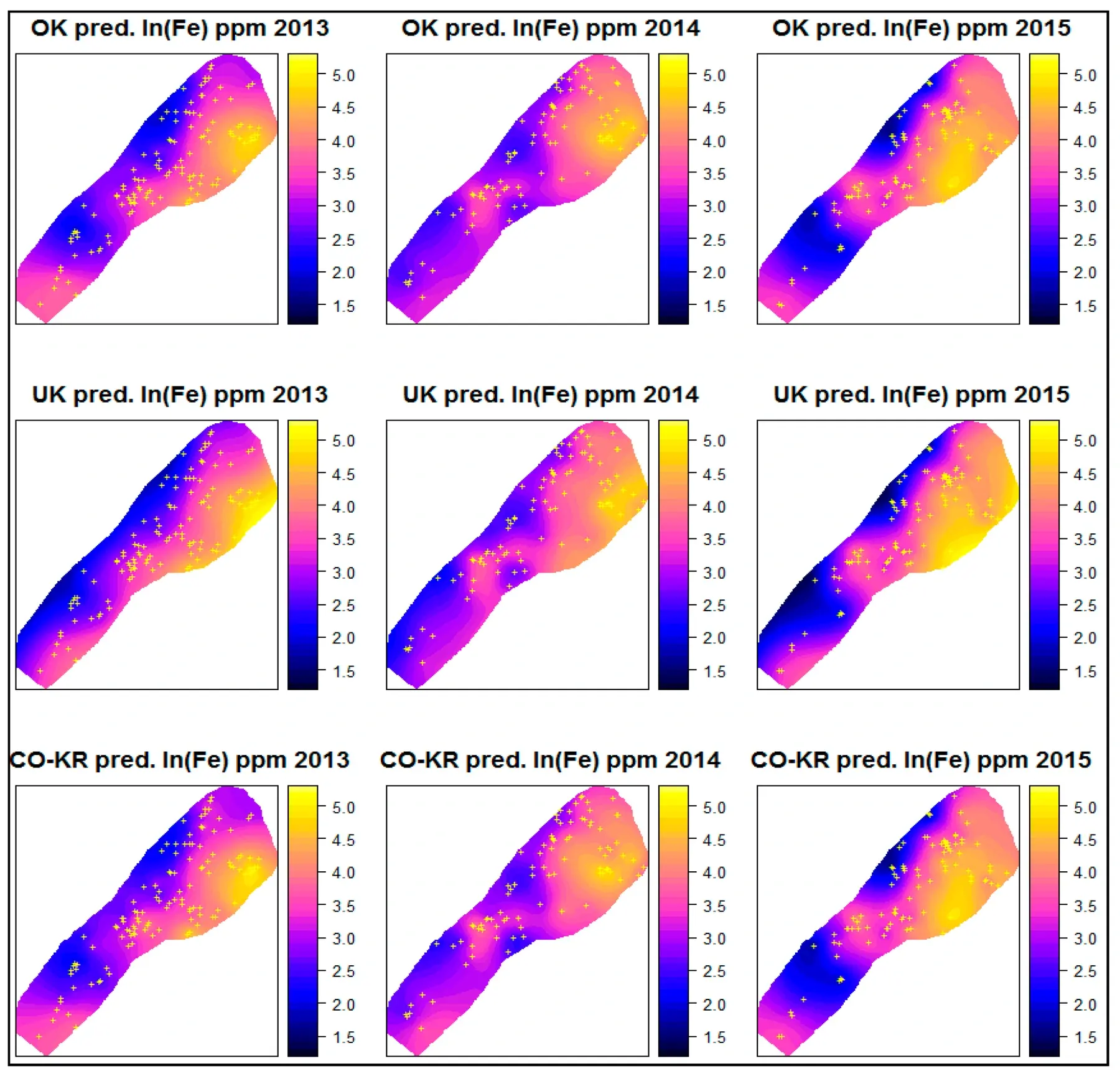
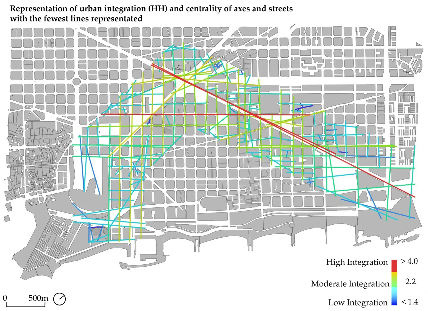
Kriging turns sparse samples into a continuous prediction surface and reports uncertainty; space syntax treats streets as a graph and measures integration, choice and connectivity. One estimates an unknown field, the other explains how urban configuration channels movement.

Significant spatial clusters and movement trajectories

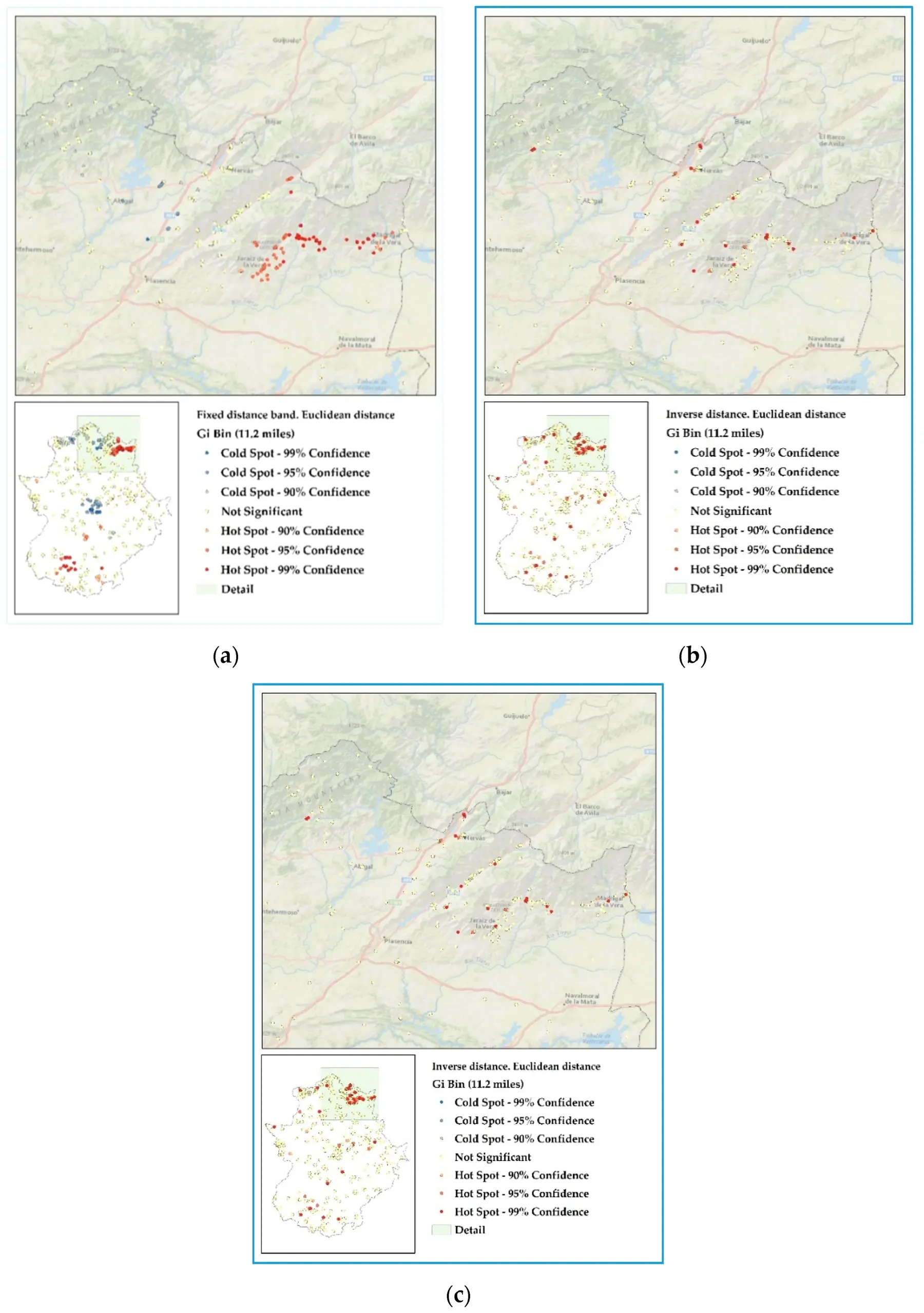
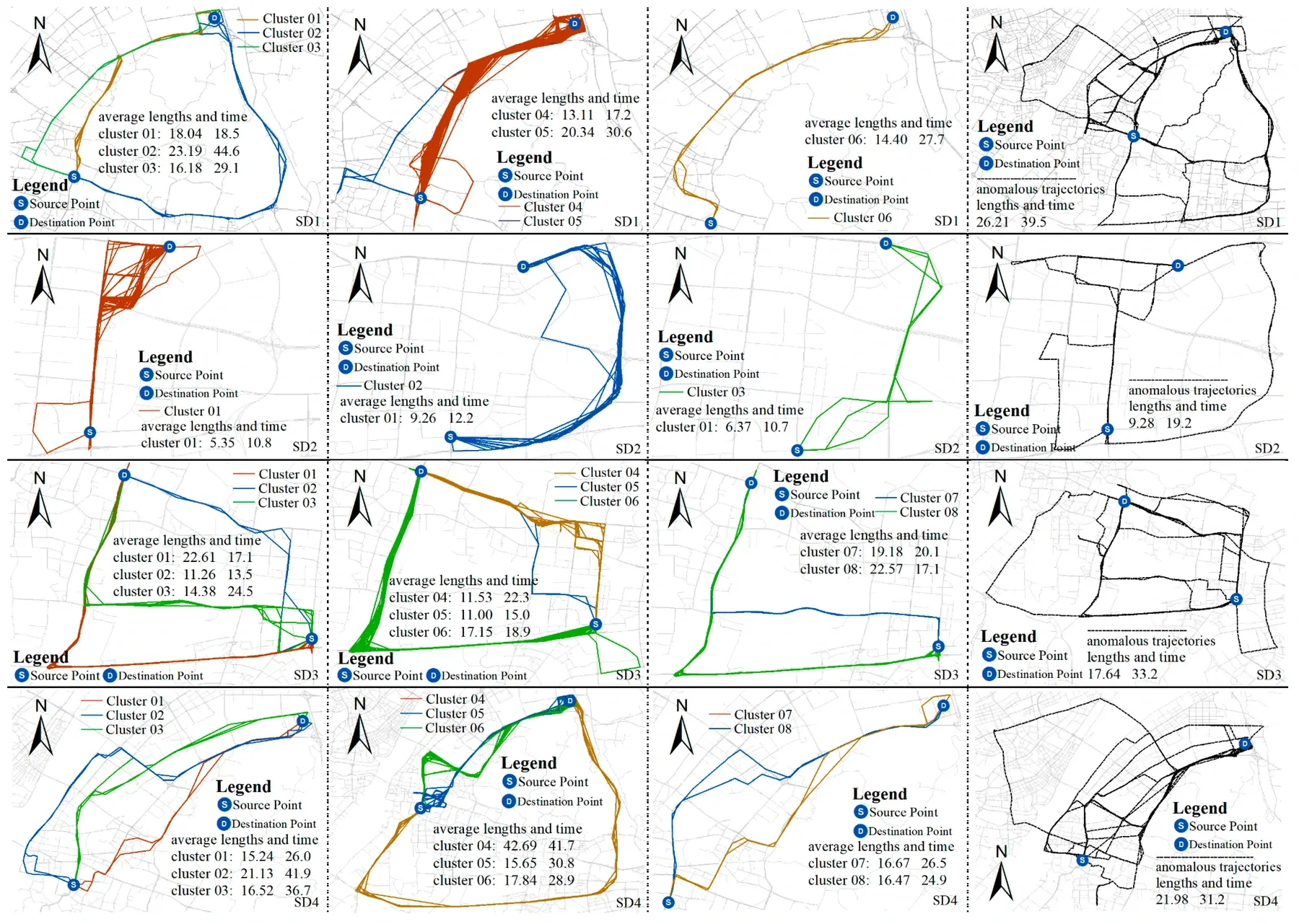
Hotspot analysis tests whether high or low values form statistically significant clusters and exposes how neighbourhood definitions change the result. Trajectory clustering groups complete movement paths, separates normal route families and flags anomalous behaviour rather than treating millions of GPS points as unrelated dots.

Operational examples: data © OpenStreetMap contributors under ODbL. Research figures are reproduced from the linked open-access papers under CC BY 4.0; each figure retains its original source and figure number.

Scope

Analysis we perform

Core GIS operations for clear questions, plus advanced spatial models for problems where distance, networks, uncertainty or time all matter.

Core spatial analysis

  • Overlay and spatial joins

    Intersect, union, clip and attribute transfer to answer what lies inside, overlaps or connects to what.

  • Proximity and buffers

    Distance bands, nearest-neighbour joins and influence zones measured in an appropriate projected CRS.

  • Accessibility and isochrones

    Walking, driving or transit catchments, service coverage and population reached within a stated travel time.

  • Routing and OD matrices

    Shortest paths, route optimisation and origin–destination travel-time matrices on real transport networks.

  • Terrain and raster analysis

    Slope, aspect, viewshed, hydrology, zonal statistics and map algebra from elevation or imagery.

  • Geocoding and data engineering

    Address matching, coordinate repair, topology checks, projection and repeatable multi-format conversion.

Advanced spatial modelling

  • Spatial interpolation

    IDW, spline, ordinary or co-kriging, variograms, prediction surfaces and uncertainty maps from sampled points.

  • Spatial clustering and hotspots

    Global and Local Moran’s I, Getis–Ord Gi*, DBSCAN and cluster/outlier analysis with significance testing.

  • Space syntax

    Axial, segment and visibility-graph analysis using integration, choice and connectivity to model movement potential.

  • Trajectory data analysis

    GPS/AIS track cleaning, map matching, stay-point detection, route clustering, flow extraction and anomaly detection.

  • Spatial econometrics

    Spatial lag/error models, geographically weighted regression and diagnostics for spatial dependence.

  • Suitability and MCDA

    Constraint screening and sensitivity-tested weighted scoring across environmental, market and network criteria.

  • Spatiotemporal change

    Panel, raster and event comparisons that quantify where a pattern changed, when it changed and by how much.

  • Automated geoprocessing

    Versioned Python, SQL or model workflows that rerun as new data arrives, with validation and audit logs built in.

Output formats

Delivered the way your stack expects

Processed layers
Result geometry as GeoPackage, GeoJSON, Shapefile or PostGIS tables.
Tabular results
Summary statistics by zone as CSV or Excel, ready for reporting.
Maps
Print-ready cartographic output with legends, scale bars and source notes.
Workflow code
The Python or SQL that produced the result, documented so you can re-run it.
Methodology note
Assumptions, parameters, data vintages and limitations, written for a reviewer.

Sample dataset

What you actually receive

Sample project data. Coverage is computed on the road network, so it reflects how far people can actually travel rather than a circle drawn on a map.

Sample project · Coverage analysis by zone · 15 minute drive time
ZonePopulationCoveredCoverage %Nearest site (min)Priority
Zone 01 · Central184,200184,200100.04.2Low
Zone 02 · North96,70078,41081.19.8Medium
Zone 03 · East112,40061,32054.614.1High
Zone 04 · South74,90022,18029.621.7High
Zone 05 · West58,30051,94089.17.4Low

Delivered work

This service on a real project

Sample projects built on this service, with the numbers they produced and what each one settled.

Heatmap AnalysisGIS AnalysisMap Visualization

Urban Heatmap Data Analysis

Turning a scattered point dataset into a normalised density surface that separates real activity clusters from population artefacts.

Input records
48,600
Records corrected
9.1%
Hotspots confirmed
2 of 5

What it showed

  • Central had by far the largest raw count and by far the largest visual hotspot, but ranked third on activity per resident. The original map had been describing population distribution, not activity.
  • Harbourside, which barely registered on the unnormalised map, was the strongest genuine hotspot at 99% confidence. It has a small residential population and a high concentration of activity, precisely the pattern raw-count heatmaps hide.
Read the full case study
POI DataLocation IntelligenceHeatmap Analysis

Restaurant Location Intelligence

Mapping a city's food and drink offer, measuring competitive density, and producing a ranked shortlist of neighbourhoods for a new venue.

Venues collected
3,180
Coverage recovered
+6%
Areas shortlisted
42 → 6

What it showed

  • Market Square, the area the operator had assumed was strongest because it felt busy, had the highest competitive density in the city and the highest incumbent ratings. Entering there would have meant competing with well-established venues for demand that was already fully served.
  • Riverside North had a third of the competitive density with over half the reachable demand of Market Square. It scored highest overall despite feeling quieter on a weekend visit, because much of its demand is workplace-based and shows up on weekdays.
Read the full case study
GIS AnalysisComputer VisionMap Visualization

Street Scene Analysis

Measuring the physical character of streets at scale using semantic segmentation, object detection and colour analysis on street-level imagery.

Network analysed
310 km
Images processed
24,800
Indicators per segment
7

What it showed

  • Green view index across the network ranged from 4.1% to 38.9%, and the distribution followed district boundaries far more closely than the team expected. Two adjacent districts differed by more than twenty points with no change in street type.
  • Enclosure ratio and green view were only weakly related. Several streets scored well on greenery while feeling open and exposed, which matters because those two qualities are often treated as one in streetscape policy.
Read the full case study

How it works

Five steps, every project

  1. Step 01

    Tell us what data you need

    Describe the spatial question and any layers you already hold.

  2. Step 02

    We define the data scope

    We specify the method, the parameters and how the result will be validated.

  3. Step 03

    We collect and process the data

    Inputs are prepared and the workflow is built as reproducible, parameterised code.

  4. Step 04

    We validate the dataset

    Results are tested for sensitivity to parameters and checked against known ground truth.

  5. Step 05

    We deliver the final result

    Layers, tables, maps, the workflow itself and a methodology note.

Quoted on complexity and data volume: how many layers the model needs, whether network analysis is involved and whether the workflow has to be repeatable. Tell us the decision it has to support and you get a fixed price first.

FAQ

Questions we get asked

Which GIS tools do you use?

PostGIS for analytical work at scale, Python with GeoPandas, Shapely and rasterio for processing, GDAL/OGR for conversion, and QGIS for cartography and review. We can deliver results that open cleanly in ArcGIS if that is your environment.

Can you work with our existing data?

Yes. We start with a validity and topology audit so problems surface before they contaminate the analysis, and we report anything we had to repair rather than fixing it silently.

Do you deliver the code as well as the result?

Yes, on request and at no extra cost. Scripts are documented and parameterised so your team can re-run them with new inputs. We think reproducibility is part of the deliverable, not an upsell.

Can you handle national or continental datasets?

Yes. Large jobs are processed in tiles with spatial indexing and, where appropriate, parallel execution. We size the approach to the data rather than pushing everything through a desktop tool.

How do you validate spatial results?

Geometry validity and topology checks first, then sensitivity testing across parameter values, then comparison against ground truth where any exists. Anything that cannot be validated is stated as an assumption in the methodology note.

Can you train our team to maintain the workflow?

Yes. A handover session plus documented code is included in most projects, and we can run longer training if your team intends to own the workflow from then on.

Next step

Have a specific data requirement?

Tell us the geography, the fields and the cadence you need for gis analysis. You get a scoped plan, a sample and a fixed price before any work starts.